
Organizations have never had more dashboards, more analysts, or more reporting infrastructure, yet a striking share of that investment goes unused once it reaches the people meant to act on it. According to a 2026 analysis of Gartner’s research, business intelligence active usage has held at roughly 29% for seven consecutive years, despite continued organizational investment in analytics tools and reporting infrastructure. The problem, in most cases, is not a shortage of data or dashboards. It is that raw numbers, presented without context or narrative, rarely change how a decision actually gets made.
Data storytelling exists to close that gap. Let us discuss in detail what data storytelling is, its frameworks, and its best practices.
Why is Data Storytelling Important?
A dashboard can hold hundreds of metrics without moving a single decision forward. Data storytelling addresses this directly by explaining what changed, why it matters, and what should happen next, rather than leaving an audience to interpret raw figures on their own. Without that layer, important findings often go unnoticed while decisions continue to be made on instinct rather than evidence.
What Are the Key Elements of Data Storytelling?
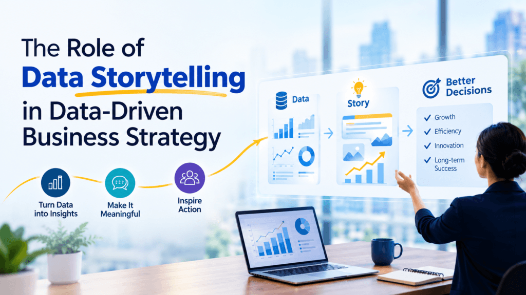
Three elements work together to make a data story effective.
- Data
The accurate, relevant information underlying the story, the foundation everything else depends on.
- Narrative
The pattern that interprets the data, the linkage of data to a business question or decision.
- Visualization
The visual representation, charts, graphs or dashboards that helps to see patterns and relationships more clearly in a snap.
How Does a Data Storytelling Framework Work?
A consistent framework tends to produce clearer, more persuasive data stories. Skipping the audience-definition step is one of the most common reasons a data story falls flat, since the same analysis often needs to be framed differently for an executive audience than for a technical team. Listed below are key steps.
| Step | What It Involves |
| Define the audience and objective | Identify who the story is for and what decision it needs to inform. |
| Identify the key insight | Find the single pattern or finding that matters most, rather than presenting everything at once. |
| Build the narrative | Structure the story around context, what changed, and why it matters. |
| Choose the right visualization | Select a chart type that makes the key insight immediately clear, not just technically accurate. |
| Add context and recommendations | Close with what the finding means and what action it suggests. |
What Are the Most Common Data Storytelling Frameworks?
Several established frameworks guide how analysts structure their narratives.
- Setup-Conflict-Resolution
Borrowed from traditional storytelling, this arc works well for presenting a problem, what caused it, and how it was resolved.
- The Pyramid Principle
Leads with the conclusion before supporting detail, well suited to executive audiences with limited time to review a full analysis.
- The “So What” Framework
Forces every finding to connect explicitly to a business implication before it earns a place in the final story, filtering out interesting but ultimately irrelevant detail.
- The Data-Insight-Action Framework
Structures a story around three fixed stages, what the data shows, what it means, and what should happen next, keeping every section tied directly to a decision.
What Are the Best Practices for Effective Data Storytelling?
A few practices consistently separate strong data stories from weak ones:
- Lead with the single most important finding, rather than a full methodology walkthrough, to keep an audience oriented from the start.
- Cut visual clutter, unnecessary gridlines, excessive color, redundant labels so the actual insight stands out rather than competing for attention.
- Tailor the level of technical detail to the specific audience, since a technically accurate story that loses its audience accomplishes nothing.
- Close with a clear recommendation rather than leaving the audience to determine the implication on their own.
- Use one chart per key point instead of combining multiple findings into a single, cluttered visualization.
How Can Data Storytelling Improve Business Decision-Making?
Well-structured data stories shorten the distance between analysis and action. A few examples illustrate how this plays out for professionals across different functions:
- Decision-makers get the conclusion and reasoning directly, rather than having to interpret a dashboard themselves. For example, a data story that opens with “customer complaints are rising because of a specific shipping delay” moves a team to act faster than a raw complaints chart would.
- Findings paired with context are more likely to be trusted and acted on than raw numbers left open to interpretation. A marketing team is more likely to shift budget when a report explains why a channel underperformed, not just that it did.
- Teams move faster when a recommendation is already attached to the data, instead of debating what the numbers mean before deciding what to do. A finance team presented with “cut spend in this category, here’s why” acts faster than one handed a spreadsheet to interpret on its own.
Building Data Storytelling and Analytics Skills
Data storytelling is part of core analytical skills rather than replacing them, and building both together tends to produce more effective results than either skill developed in isolation. USDSI’s Certified Data Science Professional (CDSP™) builds the foundational statistics and data workflow skills that any effective data story ultimately depends on, covering the analytical grounding needed before narrative and visualization can add real value.
Cornell’s Data Science Certificate, delivered directly through eCornell, covers statistical modeling, machine learning fundamentals, and data visualization in a structured, instructor-led format. Stanford’s Data Mining and Applications Graduate Certificate, delivered through Stanford Online, adds a more academically rigorous option, covering data mining, predictive modeling, and statistical machine learning across three to four graduate-level courses with academic credit included.
Conclusion
Data storytelling turns technically accurate analysis into something an organization can actually act on. As data volumes continue to grow faster than most teams can manually interpret, and as the gap between analytics investment and analytics usage remains as wide, the ability to distil complexity into a clear, audience-appropriate narrative has become less of a soft skill and more of a core analytical competency in its own right.
FAQs
Is data storytelling only relevant for presentations, or does it apply to written reports too?
It applies to both formats, since the same narrative and audience-focused principles improve clarity in written reports as much as live presentations.
Is there an automated way to use AI tools to create data stories?
While AI can help with summarizing the content in a narrative and offer ideas for visualization, the decision of which finding is most important remains a matter of judgment.
Is data storytelling a matter of “designed” skills?
Not necessarily, clarity and an organized story prevail over design, and many business intelligence applications offer pre-designed visualization templates.